Brand strategy Brand identity Web design Graphic design
Small Woods
Brand brings clarity to woodland charity

Logo

Mission statement and aims

General leaflet

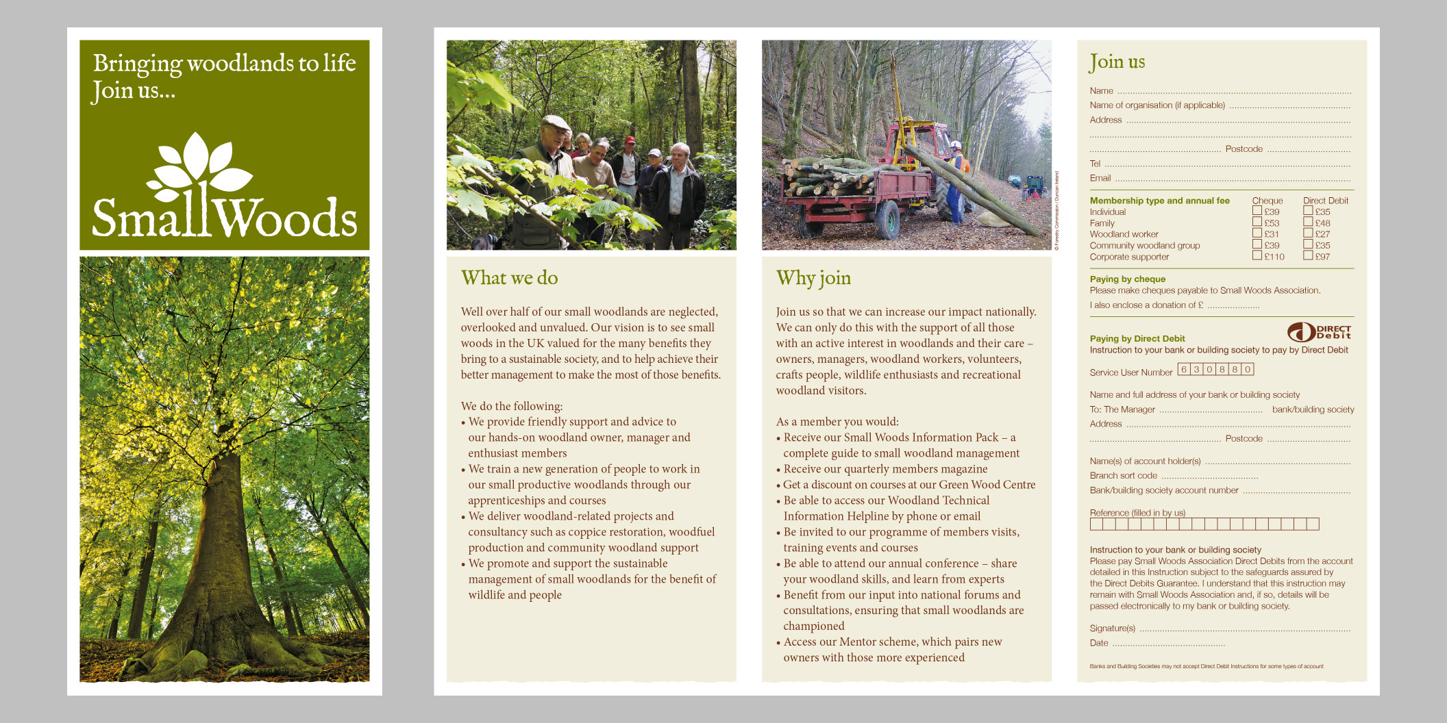
Membership leaflet

Course flyers

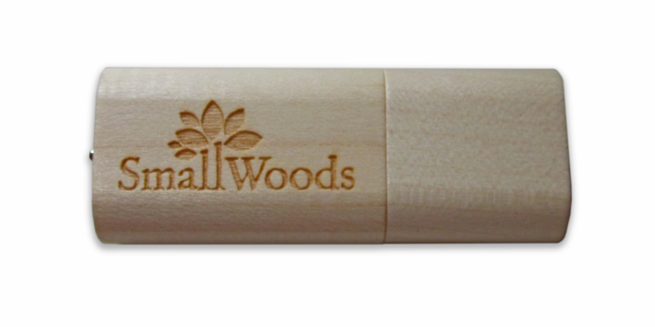
Memory stick


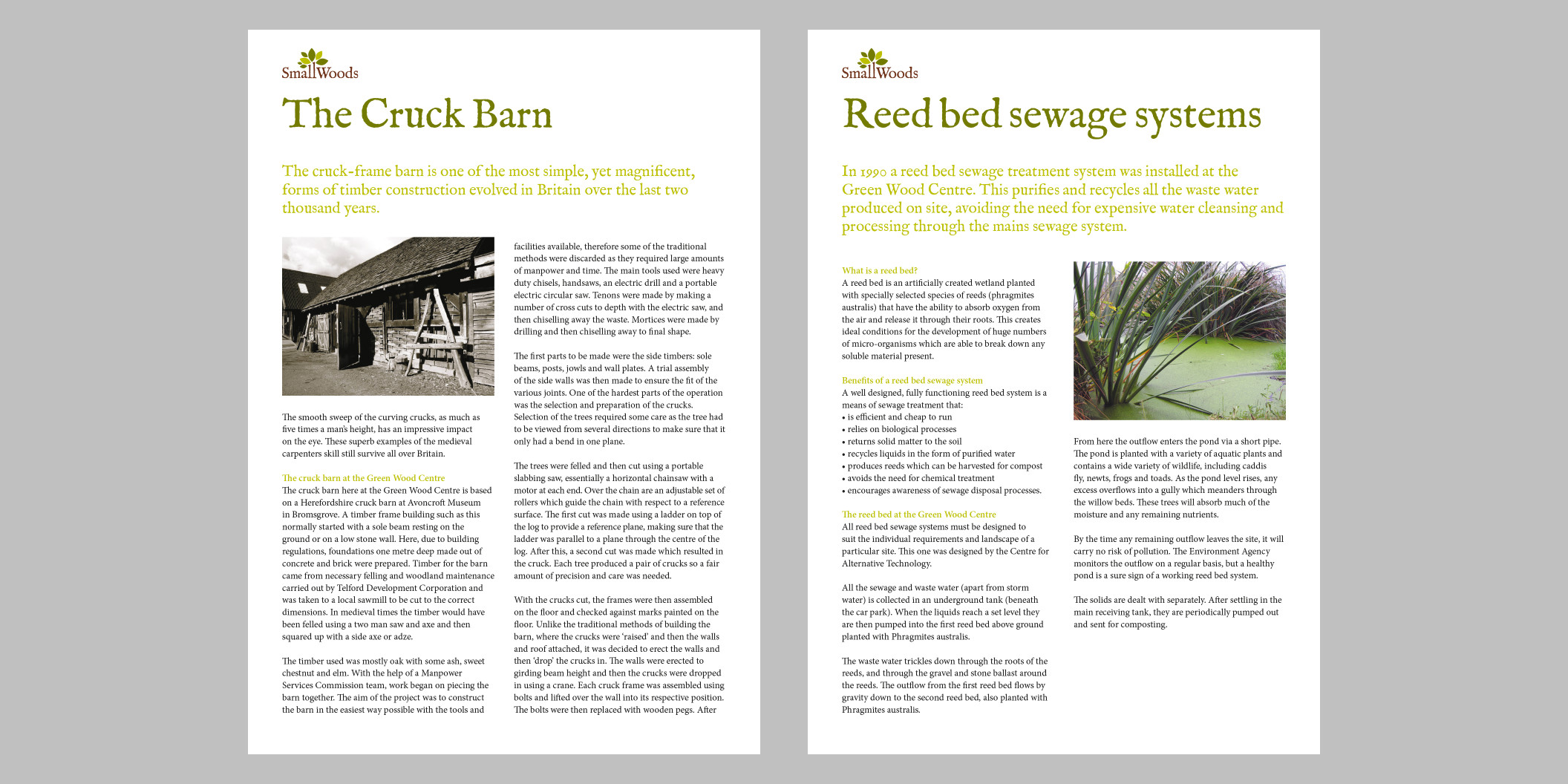
Examples of info sheets

Campaign logo

Business cards (making a small wood)
Services
Background
The Small Woods Association is the national organisation for small woodland owners, workers and supporters. The organisation champions sustainable management of woodlands.
The challenge
I was originally asked to redesign the Small Woods website. However, by asking pertinent questions, it quickly became apparent that wider communication issues needed to be addressed. Staff and trustees found it difficult to answer ‘Who are you?’, ‘What do you do?’ and ‘Why does it matter?’. There was also no visual identity beyond the logo. We placed the organisation’s print materials on a table and they looked like they were from different organisations.
I discussed with the client the need to define their brand and create a distinctive visual identity, before considering the website. They saw the value in this and agreed.
Brand and identity
Working closely with the Chief Executive I took the organisation through my branding process: researching the organisation, its audiences and competitors. From this I defined the organisation’s aims, core message and strapline. I was then able to create a visual identity expressing and reflecting the brand. The identity consists of a logo, colour palette, typeface, graphic device and paper stock. I presented the work to staff and trustees, gaining their support.
The brand and identity formed the foundations for all subsequent work.
Print materials
The client was delighted by the rebrand, identity and website and for a number of years I created all their print materials, including letterhead, business cards, general leaflets, membership recruitment leaflets, information sheets and course marketing flyers.

Website
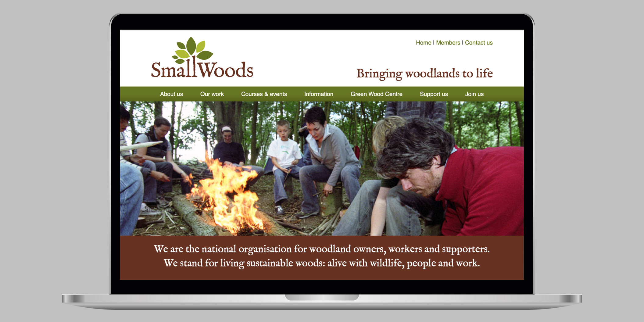
Website
I worked closely with the client to plan the new website’s structure and content – largely informed by the organisation’s four aims. Using the visual identity, I designed the page layouts and look and feel of the site. The site was then built by my web developer associate using a content management system, allowing the client to update content themselves.
We have recently made the site responsive, ensuring it can be used on mobiles, tablets and desktop computers.
Results
Small Woods now looks professional and credible. It has a distinctive and recognisable brand identity and is communicating a consistent message. Importantly, staff are proud to be associated with the website and materials.
Membership income has increased year on year and is now around 20% higher than before the rebrand. Given the economic hardship of recent years and the lack of additional marketing spend, this can be largely attributed to the enhanced branding.
Small Woods’ influence is gaining. It is increasingly being invited to meetings and to consult on policy by government and the big players in the woodland sector. We think this is again down to the improved perception of the organisation as a result of the branding.
Testimony
We worked with Mark to develop a new brand and website – and the process transformed our organisation. He made us look closely at what we do and how we do it, helping us to clarify our thinking. The rebranding really supports what we do, and the website is great: clear, fast and good looking. I am very happy with Mark’s input and approach to the contract.
Jude Walker, Director
Portfolio
-
Culture Crisis
Website for climate change psychologist
-
Kindred Forest
Beautiful website for ethical business
-
Adaptavate
Helping building industry get to net zero
-
Nuclear Information Service
Authoritative new identity and website
-
Target 2030
Helping SMEs save energy and carbon
-
Severn Wye
Designing an impactful charity report
-
Small Woods
Brand brings clarity to woodland charity
-
Nourish Scotland
Promoting food security and dignity
-
Refugee Studies Centre
Torn identity creates a professional image
-
Soil Association
Campaign raises funds and awareness
-
University of Oxford
Branding for project on young migrants
-
Good Energy
Rebranding helps to double customers
-
University of Oxford
Brand gives research project gravitas
-
Ecotricity
Graphic design for renewables business